SPA OAZE
Case Study
UX/UI design for Spa located in Vilnius specializing in Turkish Hammam
Role: Product/UX Design
|
Tools: Figma/Figma make


Problem Statement
Users struggled to book spa appointments efficiently because the business lacked a modern digital experience.


Background
HYPOTHESIS
A dedicated website with an online booking system, a user-friendly services menu, multilingual support, and clear contact details will enhance user experience, making it easier for customers to navigate services and book appointments. A simple and clean design tailored to the target audience will further improve accessibility and engagement.
Main Issues
Outdated Booking Process
Customers had difficulty selecting services and understanding appointment availability.
Confusing Service Menu
Pricing and massage details were unclear and difficult to scan quickly.
No Website Presence
The spa relied heavily on offline communication and social media.
Language Barrier
Information was only available in Lithuanian, limiting accessibility for international customers.
Background


Business opportunity
The website can serve as a go-to platform for people seeking a Turkish hammam experience in Vilnius, as there are limited options in the city. Additionally, few spas have well-designed websites with online booking, creating an opportunity to stand out and attract more customers.
Discover
Stakeholder interviews

The client wanted a loyalty rewards system and a user-friendly design for ages 16-40, highlighting Turkish hammam and stone massage. They preferred an earthy palette, provided branding assets logo and photos of the spa, and emphasized a "Book Now" button, team bios, and service descriptions.
Customers struggled with an outdated booking system, and the existing services’ menu page was not user-friendly, making it difficult to understand pricing and massage details. Additionally, the information was only available in Lithuanian, limiting accessibility for non-Lithuanian speakers and reducing potential customer reach.
"
"
Competitor analysis


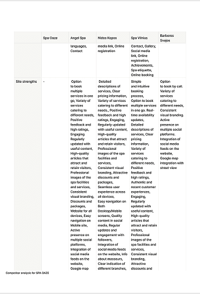

I analyzed four local competitors offering similar services. Strengths included seamless booking, detailed service descriptions, high-quality visuals, and active social media. However, many had cluttered layouts, unresponsive elements, and poor mobile adaptation. To stand out, I suggested virtual tours, a loyalty program, fast loading times, AI chatbot support, and integrated third-party reviews. Leveraging competitor strengths while addressing these gaps will create a visually appealing, user-friendly, and highly functional website.
Customer journey mapping
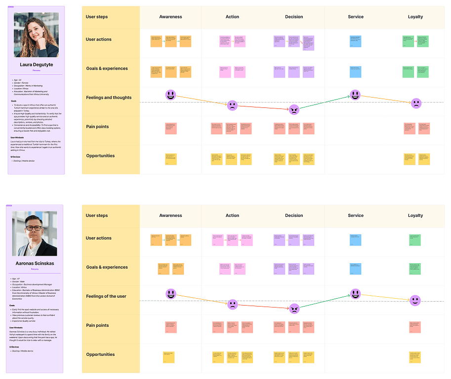
I highlighted that customers struggle to find service details, real-time availability, and reviews, making decisions difficult. Many rely on word-of-mouth but feel overwhelmed by unclear descriptions. Without an intuitive booking system, they must call for inquiries, causing frustration, especially after hours. Navigation issues, unclear lateness policies, and minimal post-service engagement add to the challenge.
Discover
Stakeholder interviews

Eglė Girdziute
Age: 22
Occupation: Marketing Specialist
User personna:
Laura wants to experience the same authentic hammam bath in Vilnius that she enjoyed in Turkey.
She wants to book an appointment at Spa Oaze and have a great experience.

I highlighted that customers struggle to find service details, real-time availability, and reviews, making decisions difficult. Many rely on word-of-mouth but feel overwhelmed by unclear descriptions. Without an intuitive booking system, they must call for inquiries, causing frustration, especially after hours. Navigation issues, unclear lateness policies, and minimal post-service engagement add to the challenge.


Jobs to be done
I highlighted that customers struggle to find service details, real-time availability, and reviews, making decisions difficult. Many rely on word-of-mouth but feel overwhelmed by unclear descriptions. Without an intuitive booking system, they must call for inquiries, causing frustration, especially after hours. Navigation issues, unclear lateness policies, and minimal post-service engagement add to the challenge.
Competitor analysis
Mind map / User flow


I analyzed four local competitors offering similar services. Strengths included seamless booking, detailed service descriptions, high-quality visuals, and active social media. However, many had cluttered layouts, unresponsive elements, and poor mobile adaptation. To stand out, I suggested virtual tours, a loyalty program, fast loading times, AI chatbot support, and integrated third-party reviews. Leveraging competitor strengths while addressing these gaps will create a visually appealing, user-friendly, and highly functional website.
Prototype
Wireframes
*The screens below showcase selected moments from the final experience, including service discovery, booking, and checkout. Additional pages, interactions, and states were designed as part of the complete prototype.


Based on the user flow, I created the wireframe, integrating research insights and stakeholder-approved features. I prioritized design consistency, accessibility, and a clear service menu while improving competitor weaknesses. Throughout the process, I made updates and had regular stakeholder check-ins.
Design


I first selected the color palette and planned image placements based on the assets provided by stakeholders. The research findings guided the design, but I made layout adjustments to enhance visual appeal and accommodate graphics. The process involved continuous updates, leading to the removal of unnecessary steps for a more streamlined experience.
Testing
Stakeholder review / User testing
The user testing focused on first impressions of the design, exploring available services, and the booking experience.

Stakeholder
Name : Andrius Markevicius
Age : 54
He was pleased with the result and appreciated the individual edit option for specific services at checkout. He liked the simple design and asked for my opinion on whether all CTA buttons in brown would work.
User
Name : Matet Markevicius
Age : 51
The user appreciated the simple and neat design. She booked quickly but felt that adding category dropdowns before the service list would improve navigation. Initially, she attempted to book directly without browsing the service menu.

Implementation

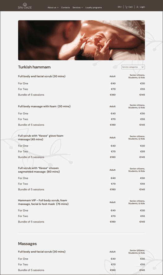


I added a category dropdown in service menu page to help users quickly find their desired service without browsing. I also included a universal search on the homepage for massages, spa descriptions, and more.
Problems/Solutions
During the project
Problem
Initially, I struggled with visualizing the booking/checkout page layout, specifically integrating time selection, artist, and client type (adult/child). Unlike competitors, we aimed to clarify which specialist and time slot matched each massage.
Choosing the right graphics and color theme was challenging, as I wanted a simple, clean, and breathable design without overcrowding elements that might hinder user engagement and conversions.
Old menu of Spa oaze

My initial idea for the checkout page

Problems/Solutions
New checkout

New service menu

Solution
I refined the service section layout through iterations and took inspiration from other websites, ensuring users could customize massage timing, specialist, and date even when booking multiple services together.
For the design, I kept the layout simple yet visually appealing, drawing inspiration from other websites. I chose colors that aligned with the spa’s interior to create a cohesive experience and make it easier for customers to remember the brand.
Conclusions
What I learned
Keeping stakeholders involved throughout the process ensures alignment with their vision and allows for quick approvals or adjustments, as seen with the tour video style and AI chatbot ideas, which they felt weren’t an immediate necessity and could be added in an update.
Experimentation is key - testing different layouts, like the checkout page, and drawing inspiration from other designs helped solve issues efficiently and improve user experience.
Prioritizing the user’s perspective ensures the design is intuitive, accessible, and meets their needs effectively.